Pantone Color of the Year: 2016
It’s a tie!
Introducing Rose Quartz and Serenity, the color PAIR Pantone has harolded as the definitive 2016 palette. Typically the color masters only choose one shade to win the coveted Color of the Year spot. 2016 demanded a change.
Last year was all about Marsala, the deep red wine hue making statements in fashion and art. Though many speculated and tried to predict the 2016 winner, this year proved to be a step outside of the box. Previous Colors of the Year include Radiant Orchid, Emerald, and Tangerine Tango. Trends are cyclical and often will repeat themselves. Looking over previous winners It’s easy to see the play between warm shades and cool tones. Pairing two colors, such as the soft Rose Quartz and the airy Serenity, is only a natural progression.
Pastels may seem old school, even boring, but not this time around! Instead of simply using the 2016 ColorS of the Year individually, the concept behind this choice is to consciously use the two together. Pink and blue are stereotypical gender colors, but this year is all about blurring those lines and breaking out of stereotypes. Use the pair in unexpected, bold ways!
Rose Quartz
Introducing Rose Quartz, the fun and flirty winner! Warm and subtle, Rose Quartz is versatile for many different interior design projects. Often pink is thought to be too feminine, but times they are a-changin’. If you’re bored with the classic pink, or if you need to give Rose Quartz a variation, try adding a hint of red or orange to make this shade fit your interiors. Some warmer colors need to be shifted a couple spots on the color wheel to really make a project work. Using the Rose Quartz and Serenity shades together is key, but if you need to make slight color variations don’t fret. Utilize a cool blue that compliments the change in tone. Some interiors need more color saturation, while some need a little more grey. Cater to your style – make Rose Quartz work for you!
“Rose Quartz is a persuasive yet gentle tone that conveys compassion and a sense of composure.” –Pantone
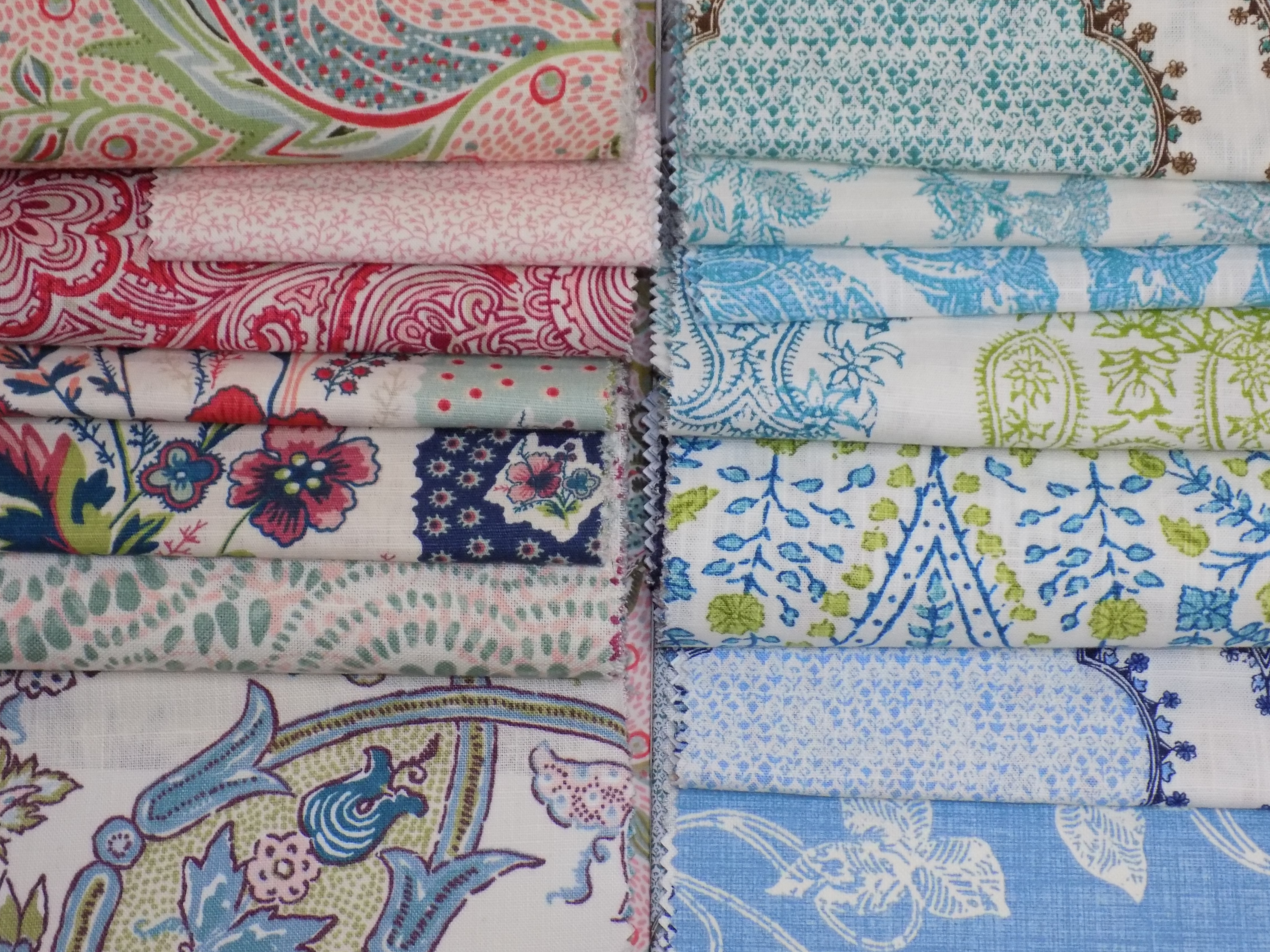
Solid Pink Matelasse img1577, Blue and Pink Stripe img9076, Solid Pink Faux Suede img9136, Pink and Cream Stripe img6849, Red and Blue Floral img9576, Pink and Blue Paisley img9051
Serenity
As open and clear as a summer sky, Serenity blue is the new favorite. Serenity is a peaceful pastel, with enough saturation to pair easily with multiple colors. Any variation of Rose Quartz will look great with this cool tone. Spa blue, teal, and seafoam green; everyone is bored of these trendy colors. Serenity is a nod to a traditional blue, but reinvented for today’s palettes. Forget your wedgewood or periwinkle. This blue is easy on the eyes and even easier to utilize for interiors. It’s not enough to merely accent with Serenity, this color can be your new favorite in every room, for any project.
“Serenity is weightless and airy, like the expanse of the blue sky above us, bringing feelings of respite and relaxation even in turbulent times.” – Pantone
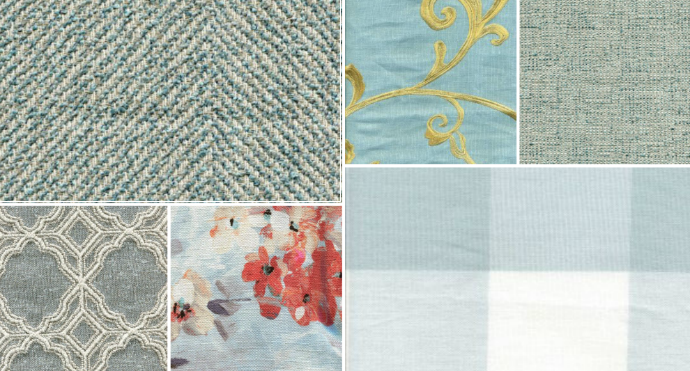
Blue Herringbone img9732, Blue and White Quatrefoil img9728, Blue and Pink Floral img9593, Blue and Gold Paisley img9743, Blue Tweed img9733, Blue and White Check img1806
2016 Collection
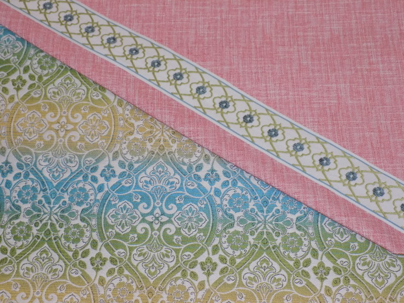
Story Board 174 shows a fun, modern take on this year’s Pantone colors. Try adding a splash of green as an accent to pull the look together. The pink tweed, as well as the ombre floral, can be used for either drapery or upholstery. The decorative gimp adds a touch of the blue and green to give more dimension to the tweed. These pieces are bright and happy, making any interior space welcoming and fresh.
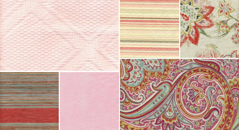
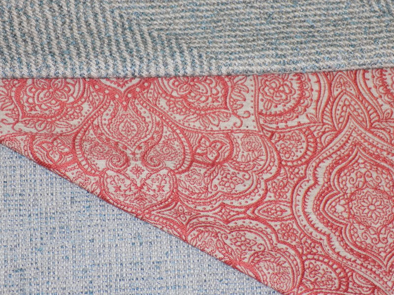
Story Board 175 is an exercise in comfort. Feel cozy and comfy surrounded by textures like these. The lotus paisley pattern could be small accents or a show-stopping complete piece. Instead of the pastel pink, we’ve chosen a coral shade. Pink with a touch of orange to give the look some depth. The blue tweed and herringbone are a soft nap, medium weight and could be used for sofa or chair upholstery. Pairing coordinates like the blue pieces allows you to mix your patterns and change up accents without worrying about your major furniture pieces.
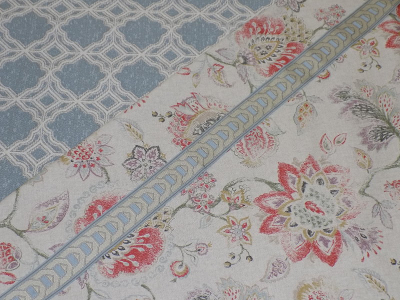
Story Board 177 is a great example of swaying the ColorS of the Year to match your style. This look gives a grey base to the colors giving a modern touch to a historical print. The upholstery weight geometric pattern makes this a very traditional style, while the lightweight floral and gimp would be a stunning drapery treatment. This floral pattern has more reds and purples than pinks and blues, but the overall effect blends and mixes the warm and cool shades Pantone suggests for 2016.
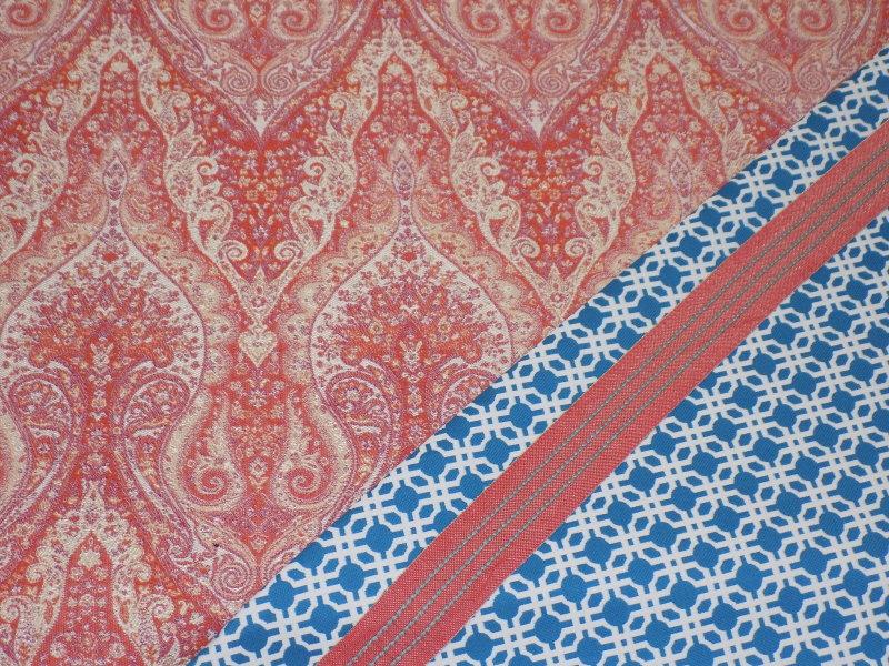
Story Board 176 is high contrast with a total saturation of color. The paisley is heavy and rich in color, made for upholstery projects and accent pieces. Go big and bold by pairing this cerulean blue geometric for drapery treatments or small accent pieces. When using bold colors make sure to mix the scale of the patterns. Because the paisley is a larger scale with shades of pink, orange, read, and yellow, we’ve paired it with a small, structured geometric pattern in a bright blue. To bring it all together we’ve shown a red and blue gimp, useful for hems, seams, and various decoration.
We’ve got new product coming in every week, bursting with colors ready to inspire your next project. We boast approximately 10,000 products for sale online and at our storefront, and there are always more fabrics and trims we would be happy to order for you.
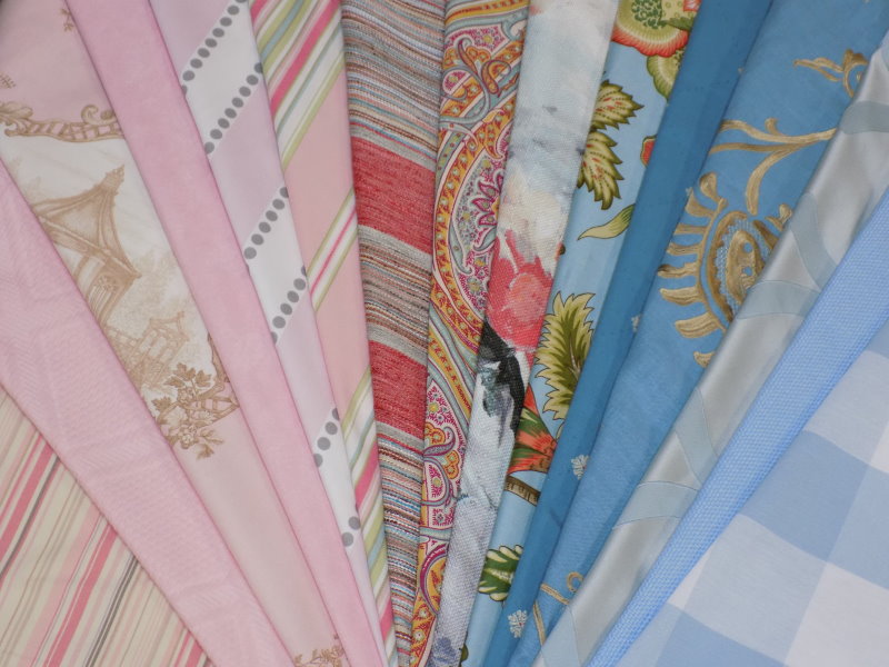
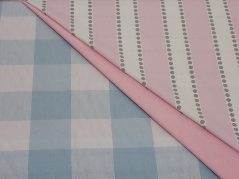
Pictured below are selections from Tilton Fenwick and John Robshaw.